In September 2023, Microsoft made a pivotal shift in its typographic identity by retiring the ubiquitous Calibri font, a staple in its suite for over 15 years, in favor of Aptos (originally named Bierstadt). This change marks the end of an era for a font that has been at the heart of countless documents, presentations, and digital creations.
As we turn the page to embrace Aptos, it’s the perfect moment to reflect on Calibri’s legacy. This article takes a deep dive into Calibri’s design journey, its role in shaping Microsoft’s visual language, and the reasons behind its iconic status in the digital world. Join us as we explore the historical milestones and the indelible mark Calibri has left on digital typography before passing the torch to its successor.
The Rise of Calibri
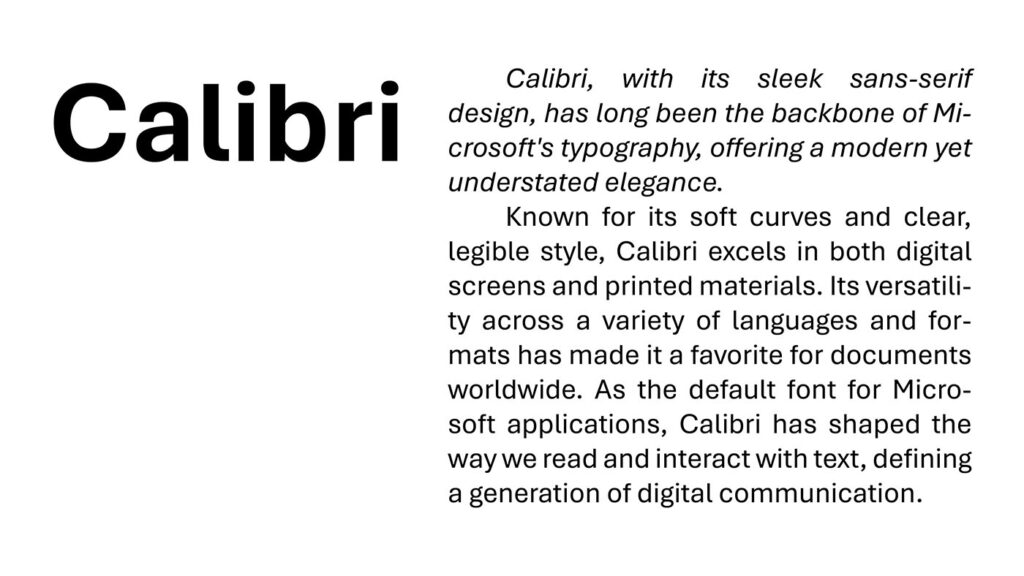
Designed by Dutch typographer Luc(as) de Groot between 2002 and 2004, Calibri was introduced as part of Microsoft’s ClearType Font Collection to leverage the ClearType font rendering technology. Its debut in Microsoft Office 2007 marked a new era, replacing Times New Roman as the default font. Characterized by its warm, soft aesthetic, Calibri stood out for its readability and modern appeal, featuring subtle roundings at the stems and corners and a relatively large x-height. This design not only enhanced legibility on screens but also made Calibri a versatile choice for both digital and print media.

Design Philosophy and Technical Mastery
Luc(as) de Groot’s vision for Calibri was to create a font that excelled on computer screens, a goal that aligned perfectly with the advent of ClearType technology. Despite initial concerns about how the font’s subtle curves would render on screens, Microsoft’s decision to go with the original, more rounded design paid off. Calibri’s design promotes readability and aesthetic pleasure, with a tight layout that maintains clarity across various text sizes. Its inclusion of characters for multiple writing systems and its array of weights and styles have made it a go-to choice for a myriad of applications.
Calibri in Use: From Documents to Scandals
Lucas de Groot, the Dutch designer behind the Calibri font, found himself unexpectedly in the spotlight due to a political controversy in Pakistan. The scandal, dubbed “fontgate,” revolved around a document related to Prime Minister Nawaz Sharif’s family, specifically a declaration by his daughter dated February 2, 2006, which was suspiciously set in Calibri—a font not publicly available until 2007. This discrepancy led investigators to conclude the document was forged, thrusting Calibri and de Groot into the center of a national corruption investigation.
De Groot, based in Berlin, expressed a mix of surprise and satisfaction over the international attention Calibri received due to the scandal. He noted the rarity for fonts to gain such recognition, highlighting how they are often overlooked despite their significance in communication.
Reflecting on the inquiries from Pakistan and elsewhere, de Groot pointed out the improbability of an unknown font being used in official documents at the time. His insights underscore the broader implications of font choice in digital documentation and the unexpected ways in which the design world intersects with global political events.
The Decision to Move On
In 2021, Microsoft announced its intention to replace Calibri with a new default font, marking the end of an era. This decision reflects evolving design trends and technological advancements. Microsoft’s introduction of five new custom-designed fonts as potential replacements underscores a commitment to diversity and modernity in digital typography.
The Legacy of Calibri
Despite its planned phase-out, Calibri’s influence on digital typography and design is undeniable. Its readability, versatility, and subtle elegance have made it a staple in countless documents and applications. The font’s design reflects a balance between formality and casualness, making it suitable for a wide range of applications. Its legacy is a testament to Luc(as) de Groot’s skillful design and Microsoft’s vision for accessible, high-quality digital typography.
Choosing the Next Default
In a significant move reflecting the ever-evolving landscape of digital design and technology, Microsoft announced in 2021 its plans to dethrone Calibri, the reigning default font since its inception in 2007. This decision not only marks the conclusion of an era dominated by Calibri’s sans-serif simplicity but also heralds a new age of diversity and innovation in digital typography. Microsoft unveiled five custom-designed fonts—Bierstadt, Grandview, Seaford, Skeena, and Tenorite—each with unique characteristics and aesthetics, as contenders to become the new default font, showcasing a dedication to modernity and user experience.
Bierstadt, named after the American West mountain, offers a crisp, clean aesthetic reminiscent of Swiss typography, appealing for its clarity and straightforwardness. Grandview, inspired by classic German road and railway signage, is designed for excellent readability at a distance and in poor visibility, making it a strong candidate for both digital and print mediums. Seaford, with its roots in the ergonomic shapes of old armchairs, provides a comfortable reading experience by balancing traditional serif warmth with sans-serif clarity. Skeena, described as a “humanist” sans-serif, draws on the forms of traditional serif typefaces to create a versatile font suitable for both text and display uses. Finally, Tenorite has the look and feel of a classic workhorse sans-serif but with a warmer, more friendly tone, featuring large punctuation marks and a tall x-height for better readability on screens.

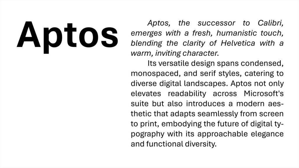
Out of these innovative designs, Bierstadt emerged as the winner and was subsequently renamed Aptos. Aptos, crafted by Steve Matteson—a name synonymous with iconic fonts such as Times New Roman, Arial, and Courier New for Windows 3.1, as well as Segoe used in the Microsoft logo—brings a blend of the classic Helvetica’s neutrality with a more approachable, human touch. Aptos distinguishes itself with a variety of styles, including condensed, monospaced, and a serif version, offering versatility and freshness in Microsoft’s typography. This font’s selection signifies a pivotal shift towards providing users with a modern, readable, and adaptable typeface, capable of meeting the diverse needs of today’s digital landscapes.
FINAL THOUGHTS
As Calibri prepares to take a backseat to a new default font, its legacy as a bridge between traditional and modern design philosophies remains intact. It’s a font that has served millions of users worldwide, making its mark on everything from business reports to personal projects. As we reflect on its contributions, we also look forward to the fresh perspectives and innovations that the next default font will bring. Calibri’s story is a reminder of the evolving nature of design and the constant pursuit of improvement and adaptation in the digital age.
THE END
Read more about Calibri: https://en.wikipedia.org/wiki/Calibri#:~:text=Calibri%20features%20subtly%20rounded%20stems,Greek%2C%20Cyrillic%20and%20Hebrew%20scripts.
Read more graphic design articles: https://eternaldory.com/category/graphics/graphic-design/

Phu is the Head Writer at Eternal Dory, where his pen dives into the latest global trends and news in knowledge, graphic design, metaphysics, and entertainment. He has a knack for highlighting the fun aspects of his subjects, lightening the mood. Phu’s academic background is in Graphic Design, focusing on Animation and Motion Graphics.


