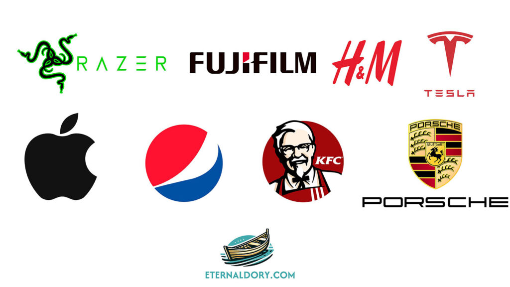
In the world of branding, a logo is not just a symbol; it’s the face of the company, embodying its identity, values, and mission. Logos come in various styles, each with its unique characteristics and purposes. From traditional emblems to modern abstract marks, the diversity in logo design is vast. This article delves into the eight types of logos, shedding light on their distinct features and uses. Also, we’ll learn about the differences between wordmark, lettermark, monogram, and letterform.
1. Combination Marks
Combination marks are versatile logos that blend text with a symbol or icon, creating a cohesive branding message. This type is prevalent because it offers the clarity of wordmark logos with the visual appeal of pictorial or abstract marks. Brands can use the text and icon together or separately, providing flexibility in various applications. Examples include Adidas, with its iconic three stripes above its name, and Burger King, which combines its name with a burger icon.
2. Wordmark (Logotype)
Wordmark logos are purely typographic, featuring the company’s name in a distinct, stylized font. This type of logo emphasizes the name itself, making it a great choice for companies with unique or catchy names. Wordmarks are about simplicity and recognition, with the font playing a crucial role in the brand’s personality. Coca-Cola’s flowing script and Google’s simple, colorful lettering are prime examples.
3. Lettermark
Lettermark logos are similar to wordmarks but use initials instead of the full company name. They’re ideal for businesses with lengthy names, condensing them into more manageable, memorable forms. The design focuses on typography and making the initials stand out. Examples include HBO (Home Box Office) and IBM (International Business Machines).
4. Monogram and Letterform
Monograms are a subset of lettermarks, consisting of two or more letters (usually initials) intertwined or combined in a creative way. They differ from simple lettermarks by the artistic way the letters are merged or styled.
A special feature within monograms is the letterform logo, which focuses on a single letter. This type stands out for its simplicity and the unique challenge it presents in embodying a brand’s essence with just one letter. The letterform is not just a typographic character but a symbol in its own right, offering a minimalist yet potent branding solution.
The difference between monogram logos and lettermarks lies in the complexity and the way initials are utilized. Monograms often intertwine letters in a decorative manner, while lettermarks might simply present the initials side by side in a straightforward, clean font. The letterform subset takes this a step further by distilling a brand’s identity into a single letter, making it distinct within the monogram category for its focus and simplicity.
5. Pictorial Mark (Brand Mark or Logo Symbol)
Pictorial marks are icons or graphic-based logos that depict a real-world object or a company’s mascot in a simplified form. These logos encapsulate a brand’s identity through an image, making them instantly recognizable without text. Apple’s bitten apple and Twitter’s bird are examples where the symbol itself becomes synonymous with the brand.
6. Abstract Logo Marks
Abstract logos use geometric forms or abstract shapes to represent the company, rather than a recognizable image. This type of logo is powerful for conveying a brand’s idea or values without being tied to a specific visual representation. Abstract marks are highly versatile and unique, allowing for complete creativity in design. Notable examples include Nike’s swoosh and Pepsi’s globe.
7. Mascot
Mascot logos feature an illustrated character that acts as the brand ambassador. These logos are often colorful, whimsical, and designed to evoke a sense of familiarity and approachability. Mascots are particularly effective for brands targeting families or children, embodying a friendly face for the company. Famous mascots include the Michelin Man and KFC’s Colonel Sanders.
8. Emblem
Emblem logos are traditional and often resemble badges, seals, or crests. They usually combine text within an icon or symbol, creating a distinguished look that can convey a sense of heritage and authority. Emblems are popular among schools, organizations, and industries that value a classical appeal, such as Harley-Davidson and Starbucks (in its earlier designs).
Final Thoughts
Logos are a critical element of brand identity, offering a visual representation that speaks volumes about a company’s ethos, industry, and values. Whether a brand chooses a modern abstract mark or a traditional emblem, the logo must resonate with its target audience, standing out in a crowded marketplace. Understanding these eight types of logos helps businesses and designers craft a logo that not only captures the essence of the brand but also connects with consumers on a meaningful level.
THE END
Read more graphic design articles: https://eternaldory.com/category/graphics/graphic-design/
Read more about logo: https://en.wikipedia.org/wiki/Logo
Phu is the Head Writer at Eternal Dory, where his pen dives into the latest global trends and news in knowledge, graphic design, metaphysics, and entertainment. He has a knack for highlighting the fun aspects of his subjects, lightening the mood. Phu’s academic background is in Graphic Design, focusing on Animation and Motion Graphics.
